I'm modifying our intraweb pages to reflect a new design that all of the offices are using. When these kinds of changes occur, it is always a pull between having a similar look and feel among all of the web pages (so users don't have to learn a new interface for every office) versus designing pages specifically for a particular function (which makes it easier for a user to access a particular function but having to learn a new interface).
Right now, the "let's make all the pages look the same" option is winning. But I'm thinking about trying something in-between. I know frames (and tables) are kind of looked down upon by the CSS fashionistas but I think I am justified in using this tool.
I say this because, in this instance, it provides for a consistent user interface and allows me to add my own customizations while being an efficient way of maintaining menus.
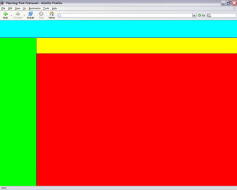
Below is the first draft of the HTML I'm thinking of using. As you can see, it uses three frameset tags. The first frameset splits the screen horizontally by creating two rows (see the light blue section for the top half in the screen shot below). The second frameset splits the bottom half of the screen into two columns (see the green section for the left column). And the last frameset splits the right column into two rows (see the yellow and red sections).
The light blue frame will be used for the department-wide banner and navigation code. This will be the same across all offices so that users will have a consistent interface to work with. In addition, the green section will have a department-wide status indicator that lets users know which computer systems are operating normally.
In the yellow frame, I'll have our own office's navigation links. These will help the user to get to the various pages that we maintain. The red frame will be where the pages that we maintain will be displayed.
As noted earlier, using frames is a very efficient way of maintaining menus across multiple pages. Rather than having to change the menu on each and every page in our sub-web (about 30 pages) when something changes, all I have to do is change one page in one of the framesets and it will be reflected on all the other pages.
So, I hope, our page will have the same navigation links across the top and left side that all other offices will have but, at the same time, have space for our own navigation menus so people can move around our own part of cyberspace.
<?xml

       version="1.0"

       encoding="utf-8"?>

      <!DOCTYPE html PUBLIC "-//W3C//DTD XHTML 1.0
      Frameset//EN"

       "http://www.w3.org/TR/xhtml1/DTD/xhtml1-frameset.dtd">
<html

       xmlns="http://www.w3.org/1999/xhtml">

       <head>

       <title>Planning Test Frameset</title>

       </head>
<frameset

       rows="15%,*">

       <frame

       src="./planning2004/hbanner.html" />
<frameset

       cols="15%,*">

       <frame

       src="./planning2004/status.html" />
<frameset

       rows="10%,*">

       <frame

       src="./planning2004/navigation.html" />
<noframes> <body>

       <p>This document can be viewed only with a

       frames-capable browser.</p>

       </body>

       </noframes>

       </frameset>

       </frameset>

       </frameset>

      </html>

Have a Great Weekend Everyone - Aloha!

Comments (1)
All this frame stuff is not nessesay to do all that. But frames are one of the best/easiest ways to integrate pages made by different people/departments into a consistent layout.
Posted by sjon | November 1, 2004 9:58 PM
Posted on November 1, 2004 21:58